
Telgani was founded in Riyadh in 2019 by Abdulkader Almkinzy and Ali Alfehaid. The pitch is easy to say and hard to run. Instead of queueing at a rental desk, you open an app, pick a car from hundreds of rental companies, and someone drives it to where you are. By the time the platform had raised $8.5 million across three rounds, closing with a $6 million Series A co-led by Hala Auto and Elm, it was listing tens of thousands of cars and promising delivery inside the hour.
That promise is the whole product. Everything on this page exists to keep it.
A marketplace is never one app
Five surfaces, one booking
Five different people touch a single booking, and each of them needs a different tool. A customer is choosing a car. A rental agent is accepting the job and preparing the vehicle. A driver is delivering it and handing over the keys. Someone at Telgani is watching all of it at once. And before any of that, a landing page has to explain the idea to a person who has never heard of it.
We designed all five surfaces, and we built them.
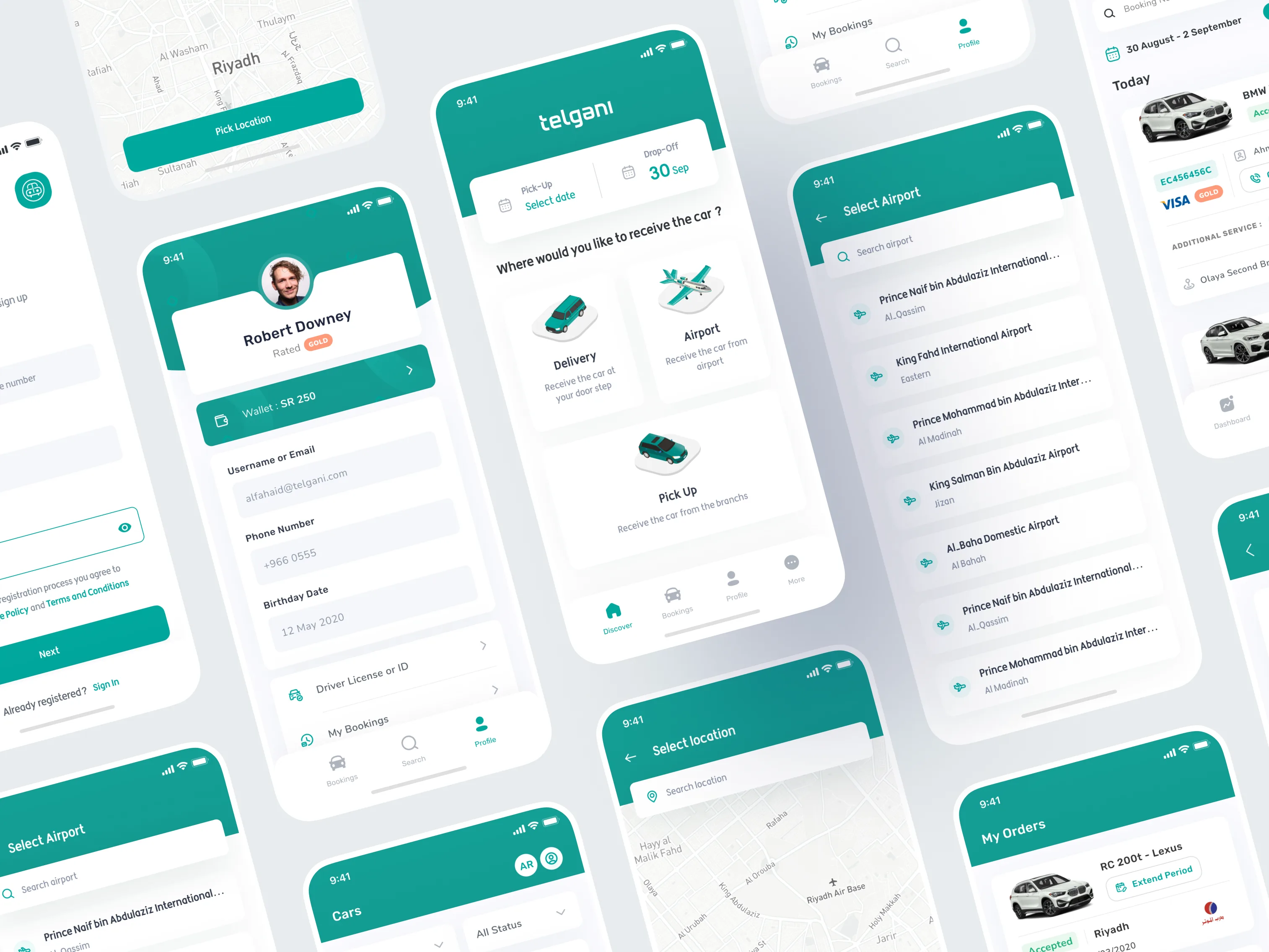
The customer app
The surface that carries the promise
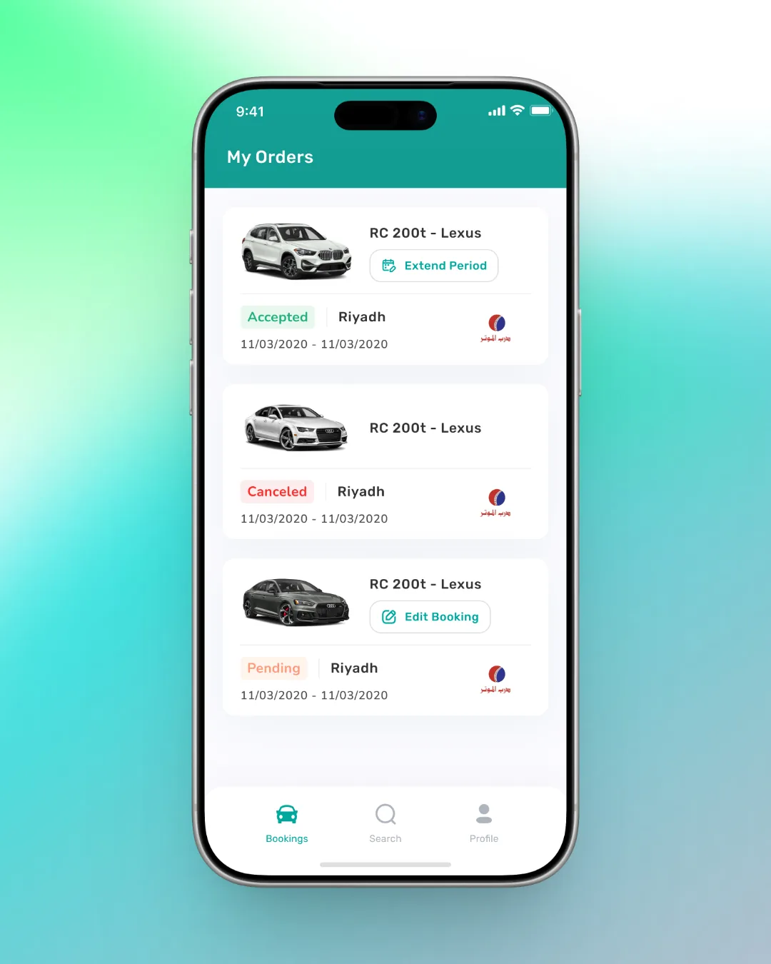
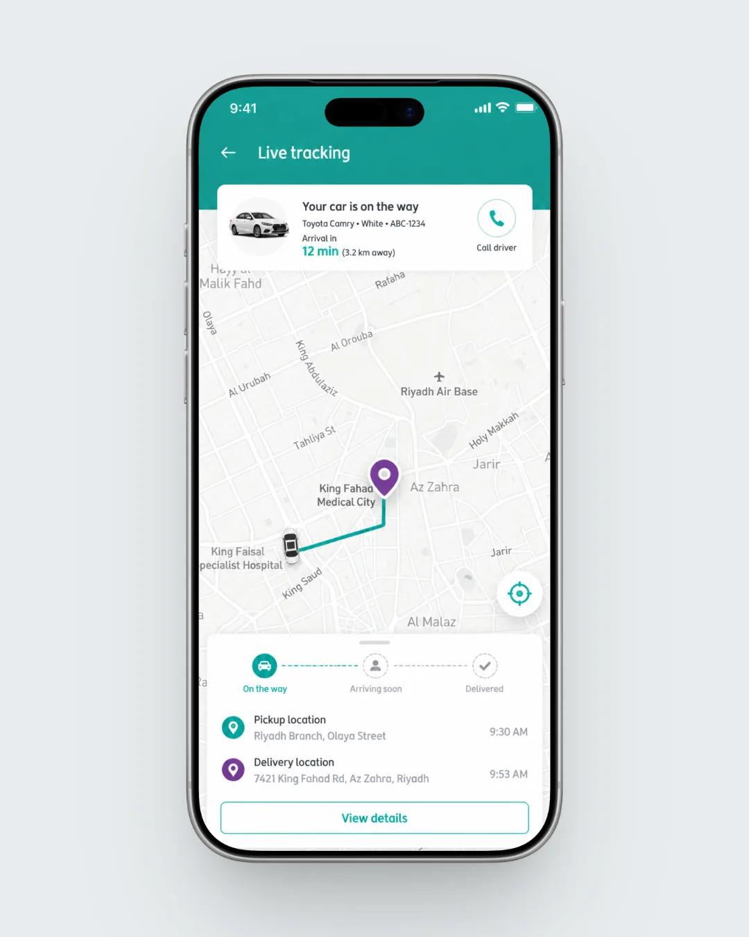
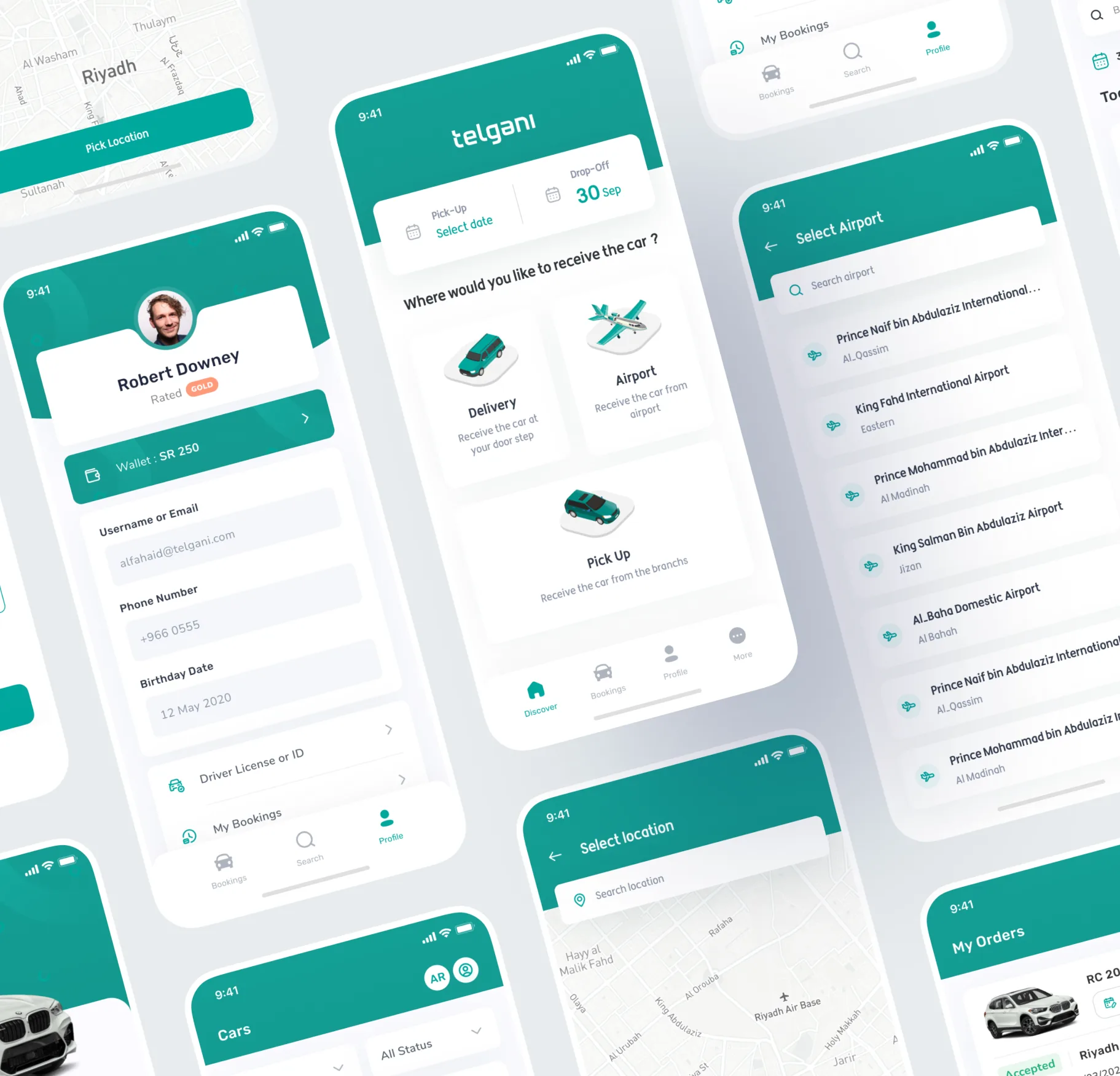
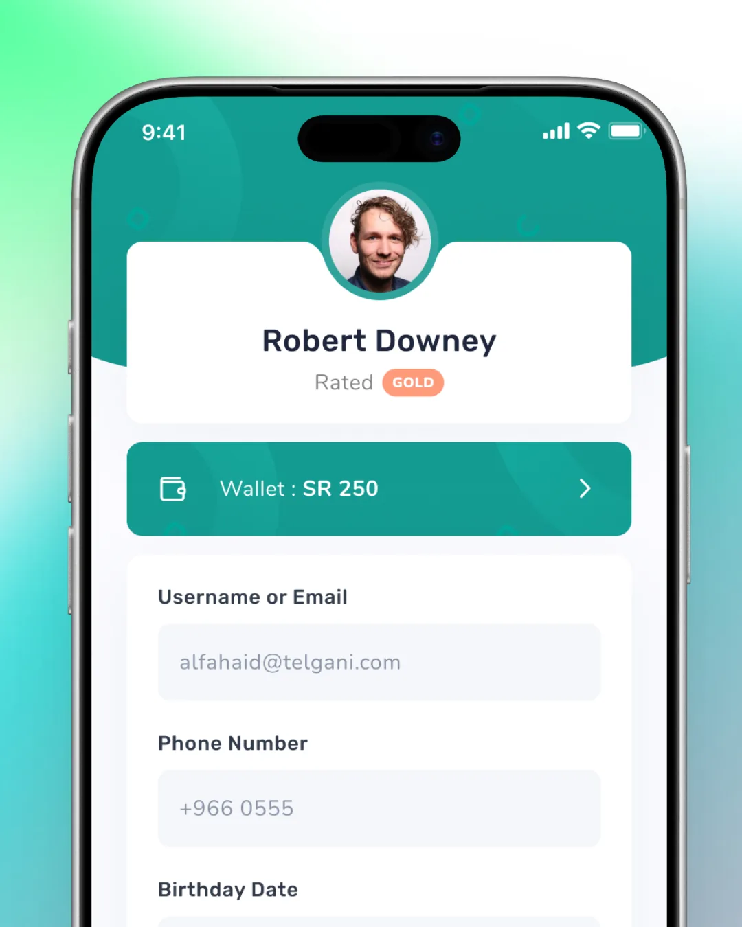
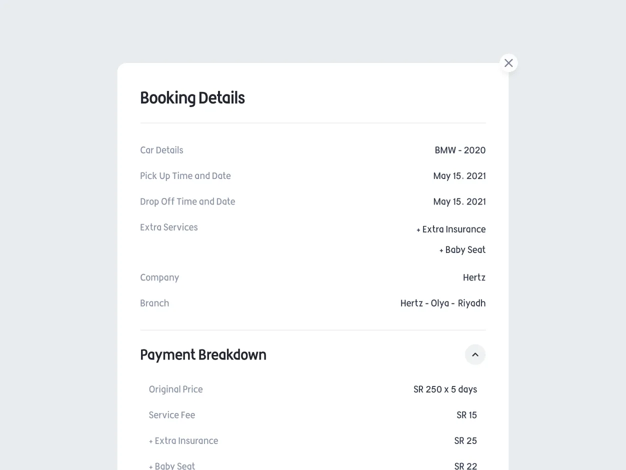
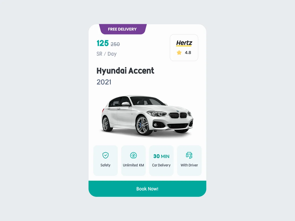
People book a rental car in the situations where they are least able to concentrate: standing outside an airport, mid-journey, minutes after landing. The design gives them the fewest possible decisions in the fewest possible steps, and answers the two questions they actually have at every point. Which car, and when does it get here.
The agent app
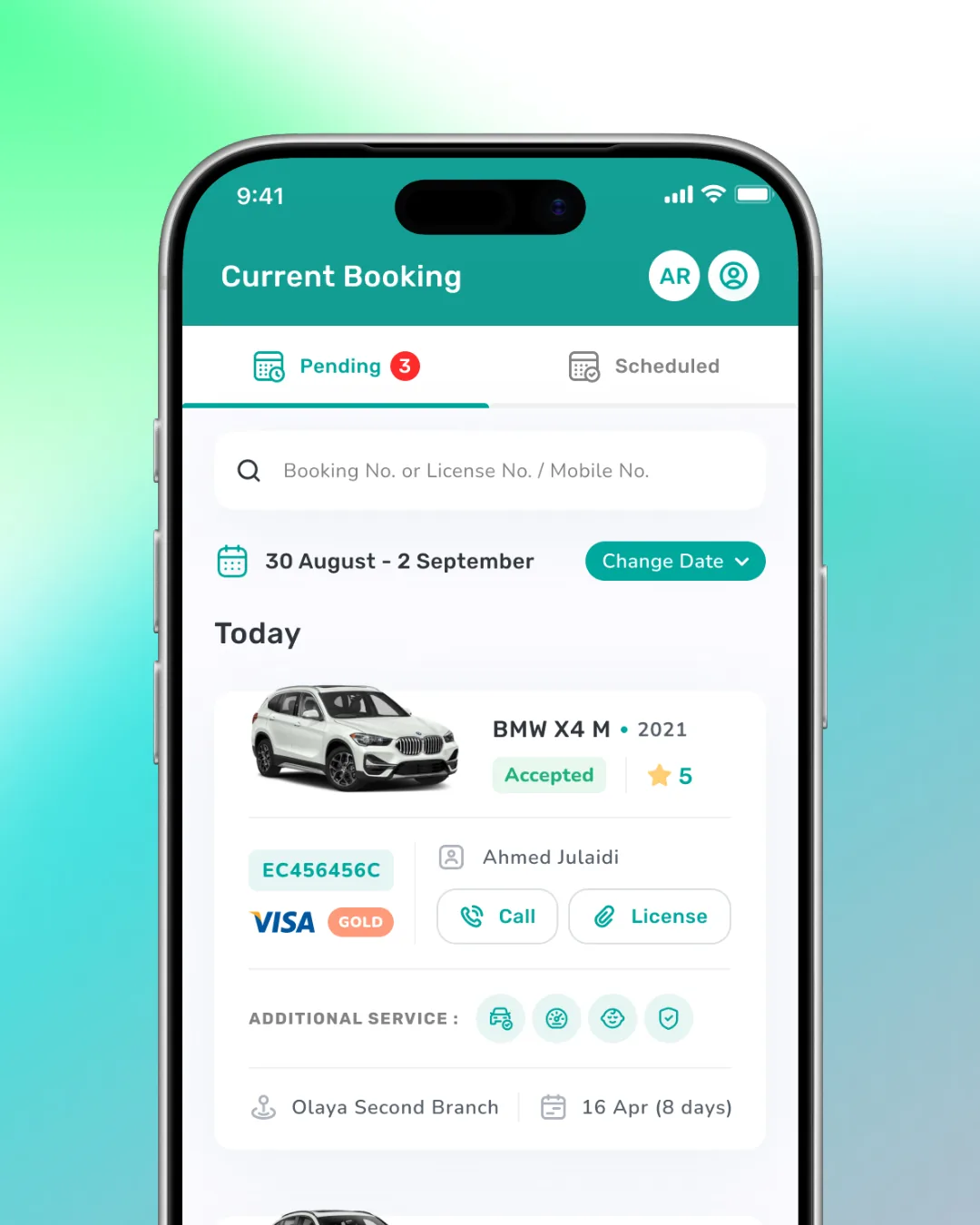
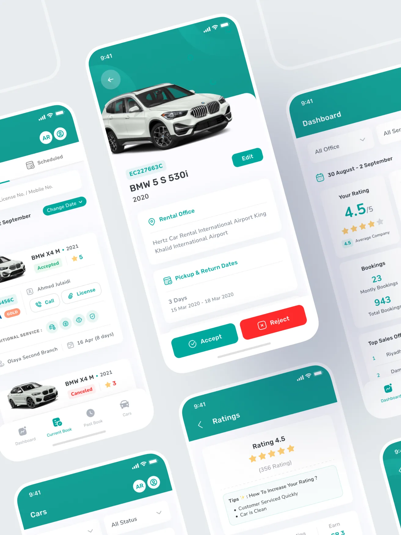
Supply has to want to use it
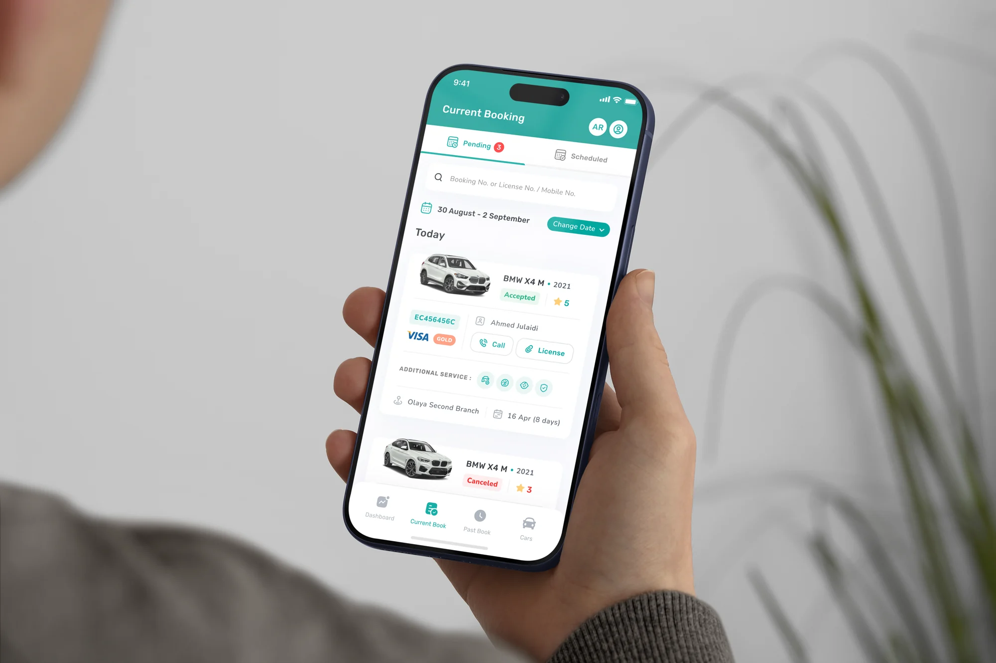
The rental companies are the supply. If the app they use is worse than the paperwork it replaced, cars stop appearing on the platform. The agent app is built around the moments that decide whether a booking succeeds: accepting the job, getting the car ready, and confirming it has left. It is designed to be usable one-handed, in a yard, by someone who did not ask for a new system.
The driver app
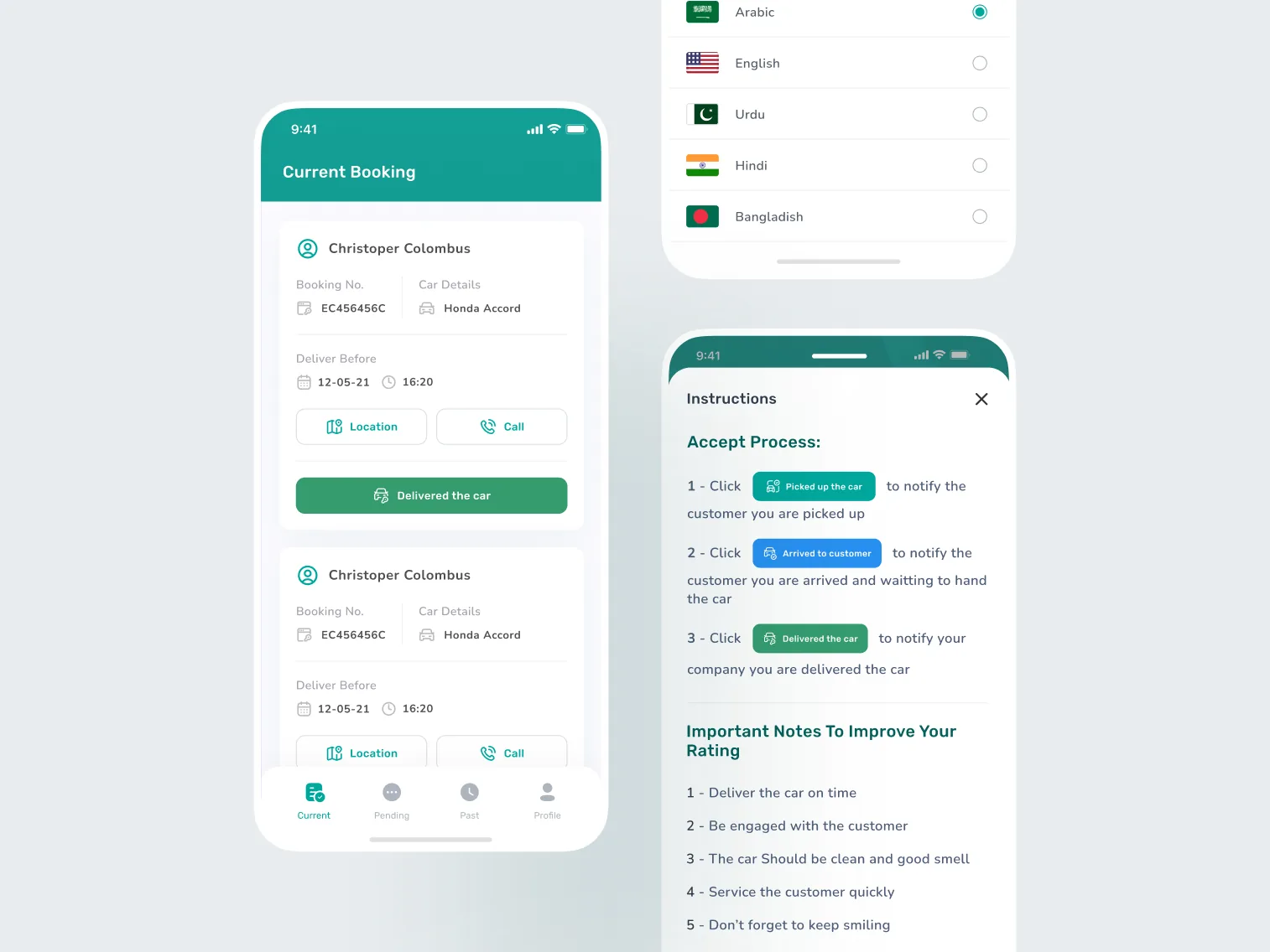
The part nobody else sees
Delivery is the part of the experience the customer never watches, which is exactly why it needs its own tool. The driver app covers the run itself: where the car is going, what state it left in, and the handover that closes the loop. Every screen is one job, because it is being read at a kerbside with the engine running.
Two dashboards, two jobs
Same shape, different work
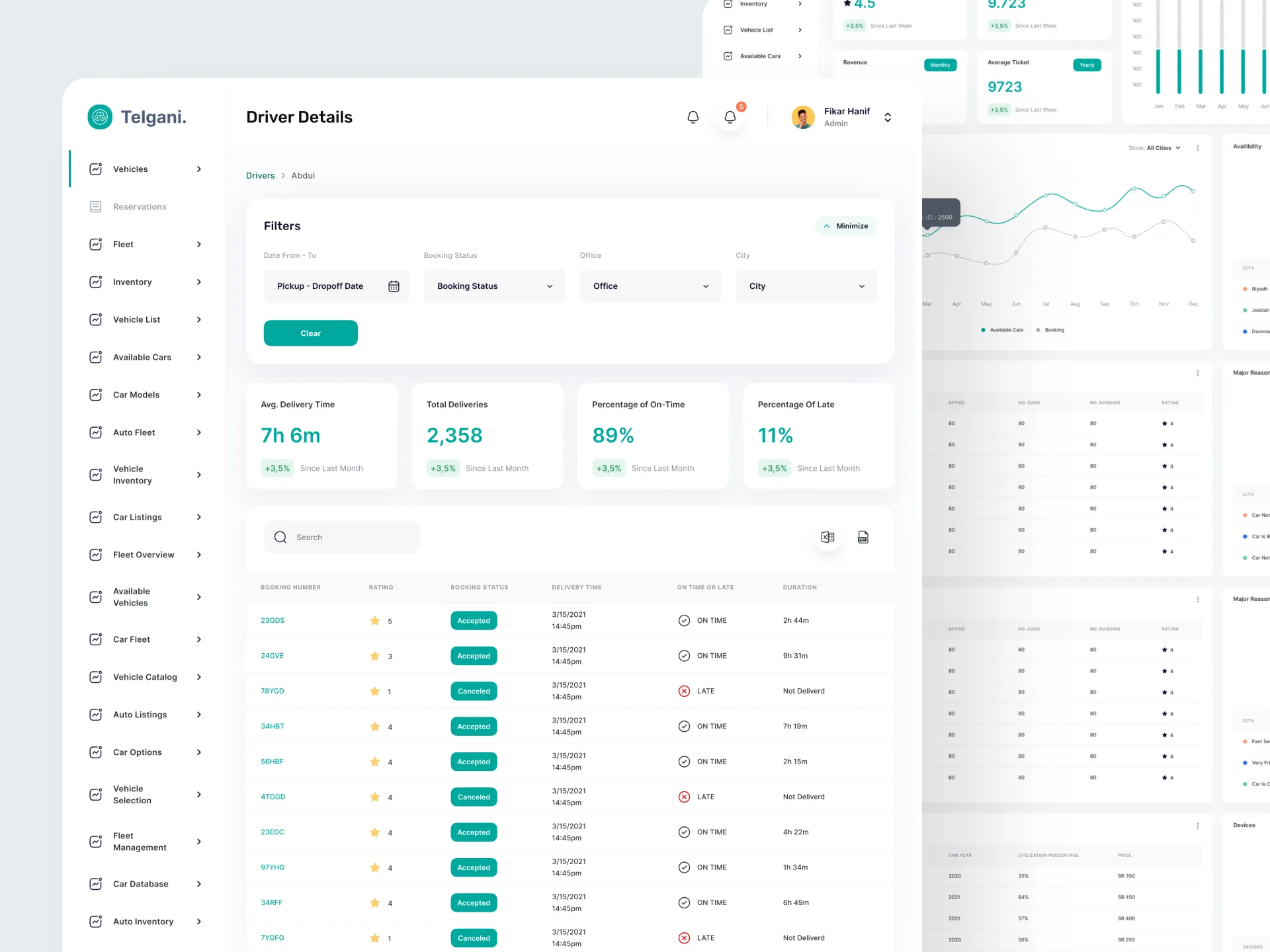
Admin and agent look similar and are not the same product. The platform dashboard is for Telgani: supply across the network, what is moving, what is stuck, and what needs a person. The agent dashboard is the desk-bound half of the agent app, for the rental company managing a fleet rather than a car.
Both are dense by necessity, so the design does the sorting. Structure and hierarchy carry the meaning, and colour is kept for the few things that are genuinely urgent. If everything is highlighted, nothing is.
The landing page
One promise, made believable
The site has one job, and it is not to describe a feature set. It is to make the delivery promise believable in the few seconds before someone decides whether to install anything, and then to get out of the way.
One system underneath
Designed and built by one team
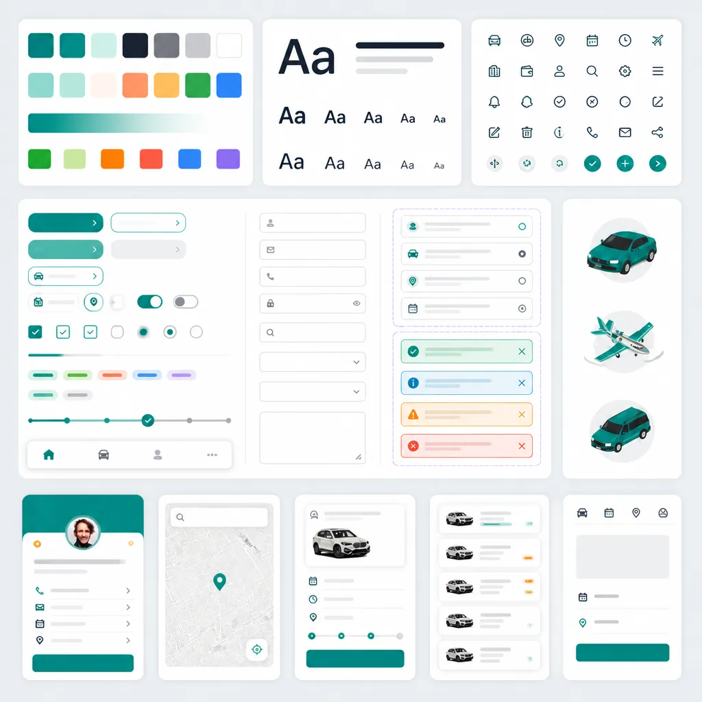
Five surfaces feel like one product because they are built from one set of parts. Type, colour, spacing and components are defined once and shared, so a change made in one place lands everywhere, and the Telgani team extends the set without us.
We were not handing files over a wall either. The same team took this from product design through to shipped software, which is the reason the seams do not show.